
Share
MKT 3130 // Marketing Principles // Fall ‘23
This was a group project that we worked on continuously throughout the semester where we had to follow a prompt and come up with our own product. For this project, I had the roles of group leader and designer. I helped plan group meetings and create presentations, a video advertisement, and a small visual brand for our hypothetical product, an app we created called Share.
Project Prompt:
“Insights make it possible to connect consumer needs and wants with a product (or service). As a part of the final presentation, you will come up with an idea for a fictitious product that connects with the insights you gather in real interviews and focus groups.
The problems that you are ideating around is something that appeals to a unisex target audience that is 50-63 years old looking for a better way to connect with their children.”

Our Product:
Share: a family communication app
After lots of brainstorming and interviews with our target audience, we decided we wanted to create an app that was easy to use, where people of all ages could connect with their family members and easily come up with topics to discuss. Anyone can use this app, but our focus was more on the family connections that could be strengthened with our product.
The app will send a notification with a short prompt to whichever parties are involved at a random point in time (each person can adjust how often they receive prompts), and the prompts will give the families something to talk about, whether it is over online chat or in person. The prompts may be super simple, such as “Talk about one good thing that happened today,” but the users can choose to mix in more sensitive topics that may be hard to bring up unprompted, like “What is one thing you have always been afraid to tell the other person?”
Our hope was that parents or grandparents could use this app to connect with the people in their family that they don’t see as often, like college students or family that have moved away.
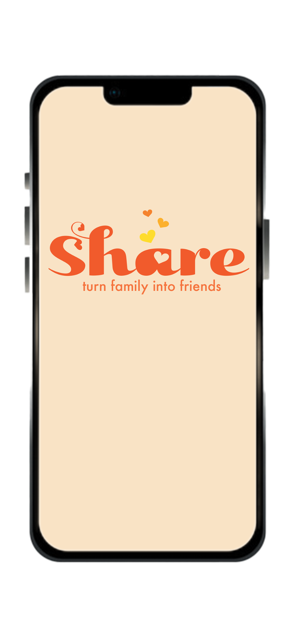
A mockup of what the home screen would look like as you enter the app or site.
The Brand Design
Although this project was not for a design-related course, I took this project as an opportunity to start working with Adobe Illustrator a bit more, doing some logo and brand design. This project focused more on the data we collected, so the actual brand identity wasn’t a massive part of the grade. We all decided that it would be nice to have a clean look for our product as well.
My goal when creating this brand identity was to develop a fun and inviting style for our app that people of all ages would be interested in, but primarily the target audience between 50-63 years old. I wanted to create something simple yet show the viewer immediately that this product has a loving and welcoming tone. I used a wordmark for the primary logo to be as direct as possible with the product name. I included hearts throughout the logo while following a warm, relaxing color scheme. The group decided we wanted to include one of our slogans, “Turn family into friends,” with our logo under the circumstances like the app or site home screen.
The final logo used for the project, as well as the app icon would be seen in the tabs bar or app home screen.
